

Getting Your Tablet Setup Right From Day One
Pressure sensitivity, driver settings, and workspace tips. Most beginners skip these but they make a huge difference in how your stylus actually feels.
A step-by-step breakdown of how professionals organize their layers, manage files, and stay efficient from rough sketch to finished piece.
Your workflow is everything. It's the difference between spending six hours on a piece and sixteen. The right process means you're not constantly second-guessing yourself or hunting for layers buried under twenty unnamed groups.
Most beginners don't think about workflow until they're frustrated. They work chaotically, add layers without naming them, and end up lost halfway through. Then they restart. We've all been there. But once you nail down a system that works for you — one that makes sense and scales — illustration becomes less stressful and more enjoyable.

Before you even touch the stylus, think about structure. You'll need layers for sketching, linework, base colors, shading, details, and effects. Some artists add a separate layer just for highlights. Others keep it simpler with five core layers. Neither approach is wrong — it depends on your style and what you're comfortable managing.
The key thing is consistency. Use the same layer setup every time you start a new piece. Name things clearly. "Layer 5" means nothing in two weeks. "Base Skin Tone" or "Shadow Pass 1" tells you exactly what you're looking at. It sounds like extra work at first, but you'll save hours when you're editing later and need to find that specific adjustment layer fast.
Set your canvas size before you start. Don't change it mid-project. If you're working for print, go 300 DPI. For web, 72 DPI is fine. Most professionals work in RGB color mode unless they're prepping for a specific print process. Lock your canvas dimensions and color space from the beginning.
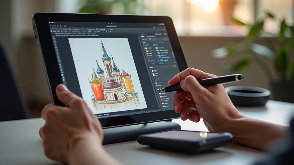
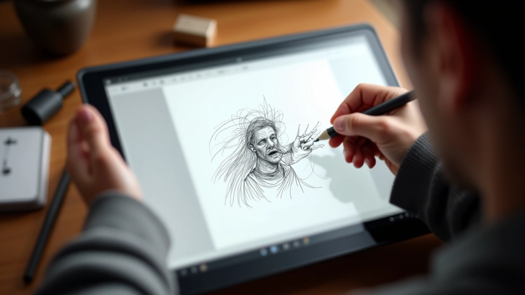
Create a sketch layer and reduce the opacity to about 40-50 percent. This makes it easier to draw over later. Don't overthink the sketch. Rough shapes and gesture lines are all you need at this stage. The sketch layer is your foundation — it guides everything that comes next, but it doesn't need to be perfect.
Many artists use a light blue or purple color for sketches instead of black. It's easier on the eyes during long sessions and creates visual separation from your actual linework. Once you're happy with the composition and proportions, you'll lock this layer and move forward.
Don't merge or delete the sketch yet. Keep it separate until you've finished inking. If something feels off halfway through, you can toggle the sketch visibility to reference it quickly.
Once the sketch feels solid, create a new layer above it for linework. Use a pen brush with a defined tip — something between 2-4 pixels depending on your canvas size. A consistent line weight looks more professional. If you want variable weight, learn to adjust pressure sensitivity on your stylus rather than changing brush sizes constantly.
After you've finished inking, flatten the sketch and linework into one layer or keep them separate — both work. Then add a base color layer underneath. Don't worry about shading yet. You're just blocking in the main colors. Use a paint bucket tool or paint over large areas with a soft brush at reduced opacity. This layer becomes your roadmap for where colors go.
Set this layer to multiply or overlay mode if you want the linework to blend naturally with colors below. Many illustrators prefer multiply mode because it preserves color variation while keeping lines visible.


Here's where patience matters. Create separate layers for shadows and highlights. Use a dark color (not pure black) for shadows — maybe a dark blue or brown depending on your color scheme. Add shadows with a soft brush at around 60-70 percent opacity. You want depth without harshness.
Add highlights on another layer using white or a very light tint of your base color. Again, soft brush, reduced opacity. This approach lets you adjust shadow and highlight intensity independently. If the shadows feel too dark, you can lower that layer's opacity without affecting highlights.
Once shading is done, add detail layers for small refinements — texture, extra definition, tiny highlights. Keep these on separate layers so you can edit or remove them without rebuilding shading. Many professionals spend 30 percent of their time on sketching and base colors, then 70 percent on shading and details. That's where the illustration actually comes alive.
Save your work file as a PSD, XCF, or whatever native format your software uses. Keep the layered version. This is your working file with all layers intact. Once you're done, export a flattened JPG or PNG for sharing and archiving. Never delete the original layered file — you might need to make edits six months from now.
Create a folder system that makes sense. Something like: Projects → [Project Name] → Working Files → Exports. Keep sketches, final files, and reference images organized in the same place. Use consistent naming. "Illustration_v1.psd", "Illustration_v2.psd", "Illustration_final.psd" beats "New_Painting_FINAL_FINAL_ACTUAL.psd".
Back everything up. A crash or corrupted file can cost you hours of work. Cloud storage like Google Drive or Dropbox auto-saves, which is safer than relying on manual saves. Some artists keep copies on external drives too. It sounds excessive until it saves you from disaster.
Use clipping masks to constrain new layers to specific areas. This prevents you from accidentally painting outside the lines.
Work zoomed in for details, but zoom out every 10-15 minutes to check overall composition and proportions.
Group related layers together. All shadow layers in one group, all details in another. Keeps your panel clean.
Learn shortcuts for your most-used tools. It's faster than clicking menus and keeps you in a flow state.
Use hue/saturation, curves, or levels as separate layers to tweak colors without destroying your painting.
Lock layers when you're finished editing them. Prevents accidental edits and keeps focus on what's next.
Individual learning outcomes and workflow preferences vary from person to person. The techniques described here are common approaches used by many digital illustrators, but your personal workflow might look different. Experiment with different layer structures, naming conventions, and file organization until you find what works best for your creative process and style.
Your workflow is personal. What works for someone else might feel clunky for you. The goal isn't to copy someone else's system perfectly — it's to build one that makes sense in your brain and keeps you productive. Start with the structure we've outlined here, then adjust as you discover what you prefer.
Don't expect to nail this on your first try. You'll probably reorganize your layer structure a few times. You'll discover new techniques that change how you approach shading. You'll find keyboard shortcuts that save you minutes every session. That's normal. Your workflow evolves as you improve.
The real win is when you stop thinking about the process and just illustrate. When organizing layers becomes automatic, when you know exactly where to find things, when you're not wasting time hunting through menus or restarting because you messed something up. That's when illustration gets fun.

Editorial Team
Written by the deltarite editorial team, focused on clear, practical guidance for beginner digital illustrators.
Pressure sensitivity, driver settings, and workspace tips. Most beginners skip these but they make a huge difference in how your stylus actually feels.
Both have their place. We break down what each does best and why starting with raster gives you more flexibility when you're beginning.
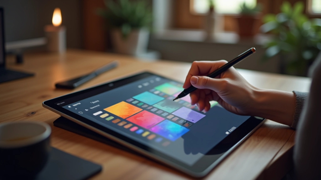
You don't need to understand every color model. These three principles will fix most color problems and make your illustrations feel cohesive.